menu
Agent & Homeowner Experience
Agent & Homeowner Experience
Agent & Homeowner Experience
Agent & Homeowner Experience
The first B2C expansion of Doma's software services, to Real Estate Agents and Homeowners.
The first B2C expansion of Doma's software services, to Real Estate Agents and Homeowners.
The first B2C expansion of Doma's software services, to Real Estate Agents and Homeowners.
The first B2C expansion of Doma's software services, to Real Estate Agents and Homeowners.
00
00

00

00

problem
How do you identify, explore, and build for a new – but adjacent – user segment?
solution
A new approach from the ground up, for users who expect a consumer-grade experience.
problem
How do you identify, explore, and build for a new – but adjacent – user segment?
solution
A new approach from the ground up, for users who expect a consumer-grade experience.
problem
How do you identify, explore, and build for a new – but adjacent – user segment?
solution
A new approach from the ground up, for users who expect a consumer-grade experience.
problem
How do you identify, explore, and build for a new – but adjacent – user segment?
solution
A new approach from the ground up, for users who expect a consumer-grade experience.
Doma software had historically worked behind the scenes - our Escrow Officers worked with agents in person to secure business, which was managed and processed by our internal teams working on Doma's in-house tools. These new products, aimed at homeowners and REAs, helped expose our unique machine intelligence and value to new audiences.

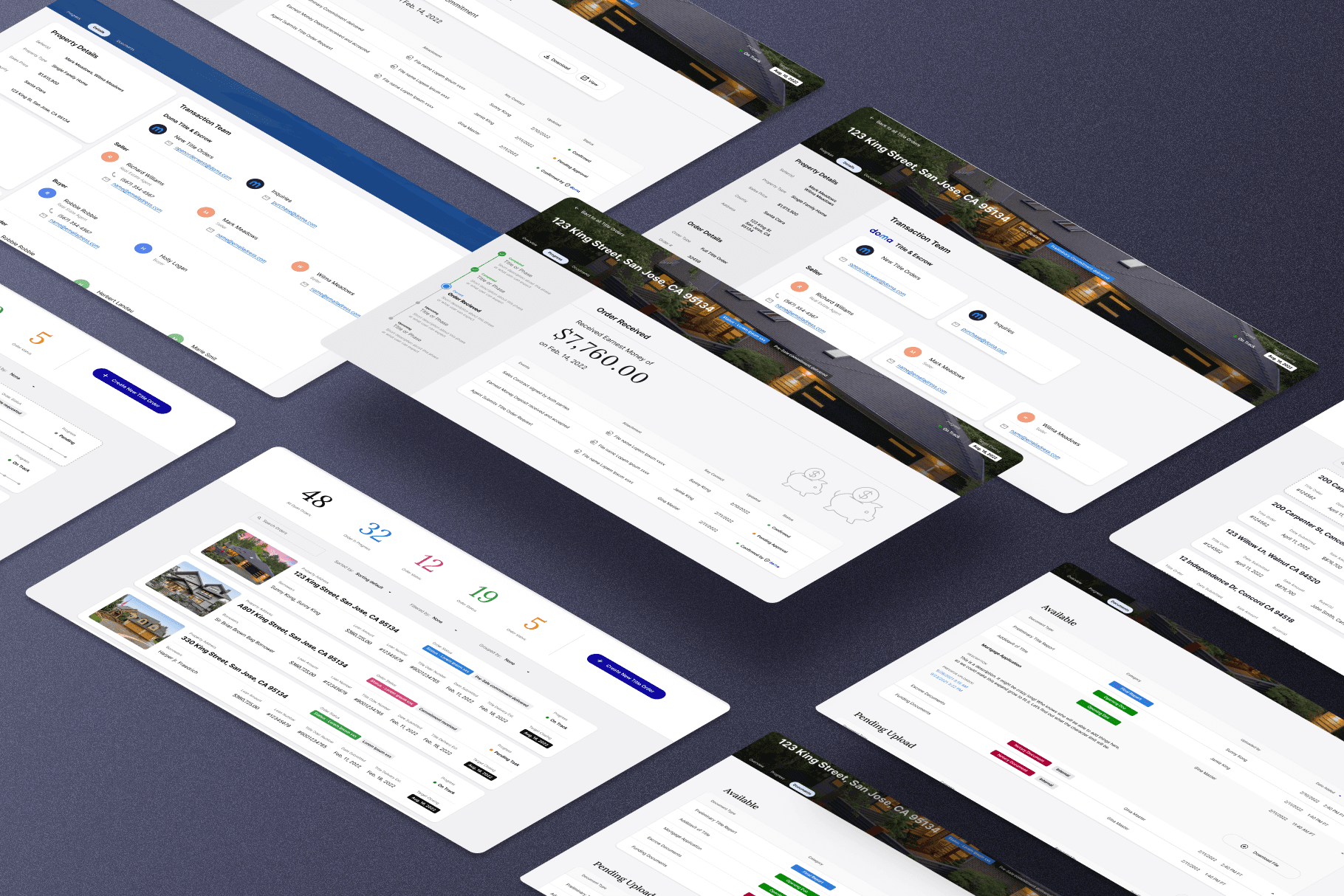
I paired with Kat Cordio - an incredibly talented design manager and peer - on a heads down, four week sprint to kick off this work - we moved from paper prototyping in week one to lo-fi visuals in week two, through to hi-fidelity, interactive designs by week four. At the end of our sprint, we paired with our design systems team to bring our designs into dev-ready screens like the above.
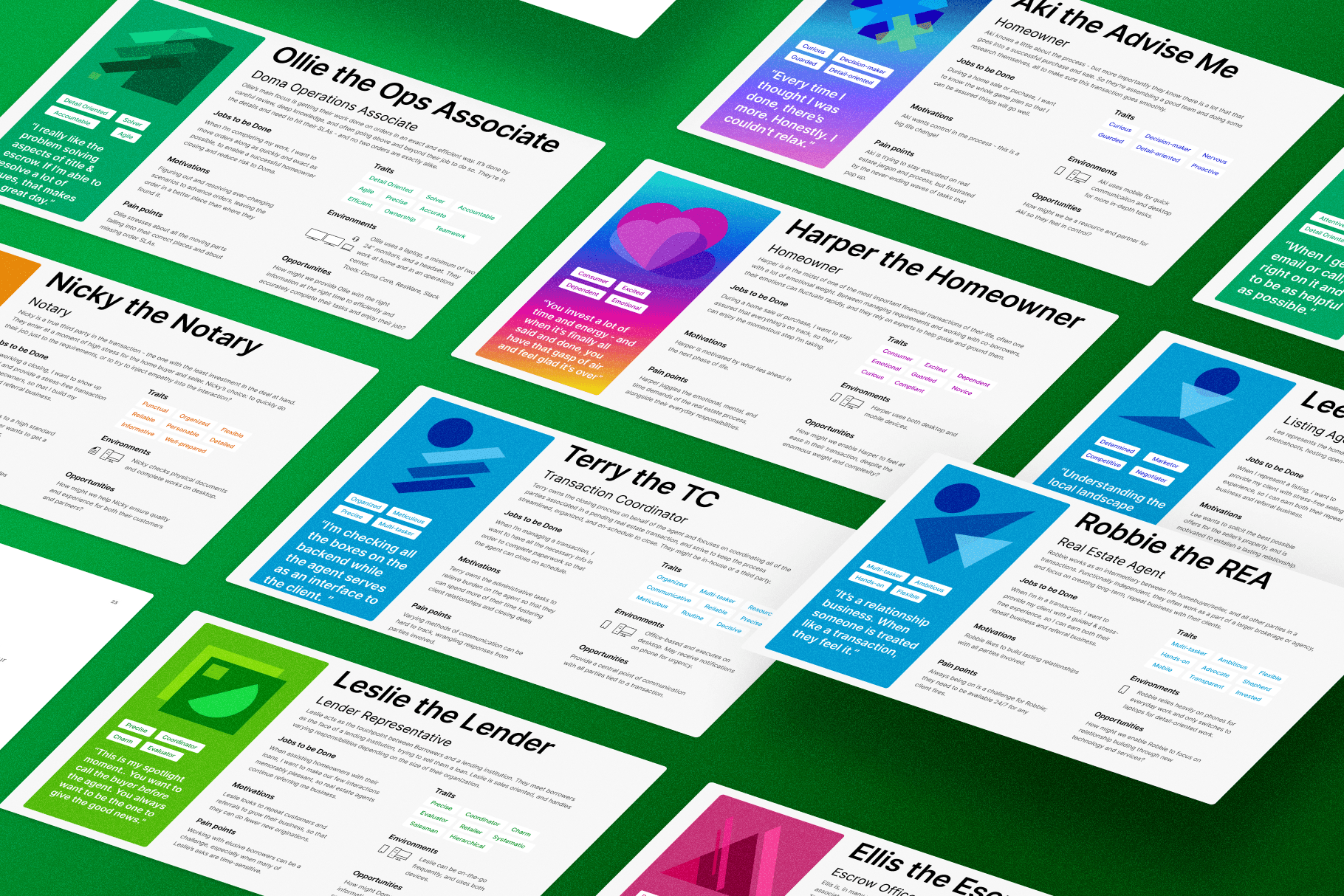
Each week, we spoke with real users, testing and iterating on our designs, and planning prioritized updates for the following week. We divided and conquered our work, trading off page design and testing responsibilities, while juggling stakeholder management and communication.
At the end of this sprint, we were able to get executive buy-in through direct presentations to the C-Suite, including the CEO and CTO, and then worked alongside the rest of the design, product and engineering team to begin implementation and refinement.
Below are samples of our design & our process.

Final iterations of our homeowner facing portal, after working with our design systems team for guidance.
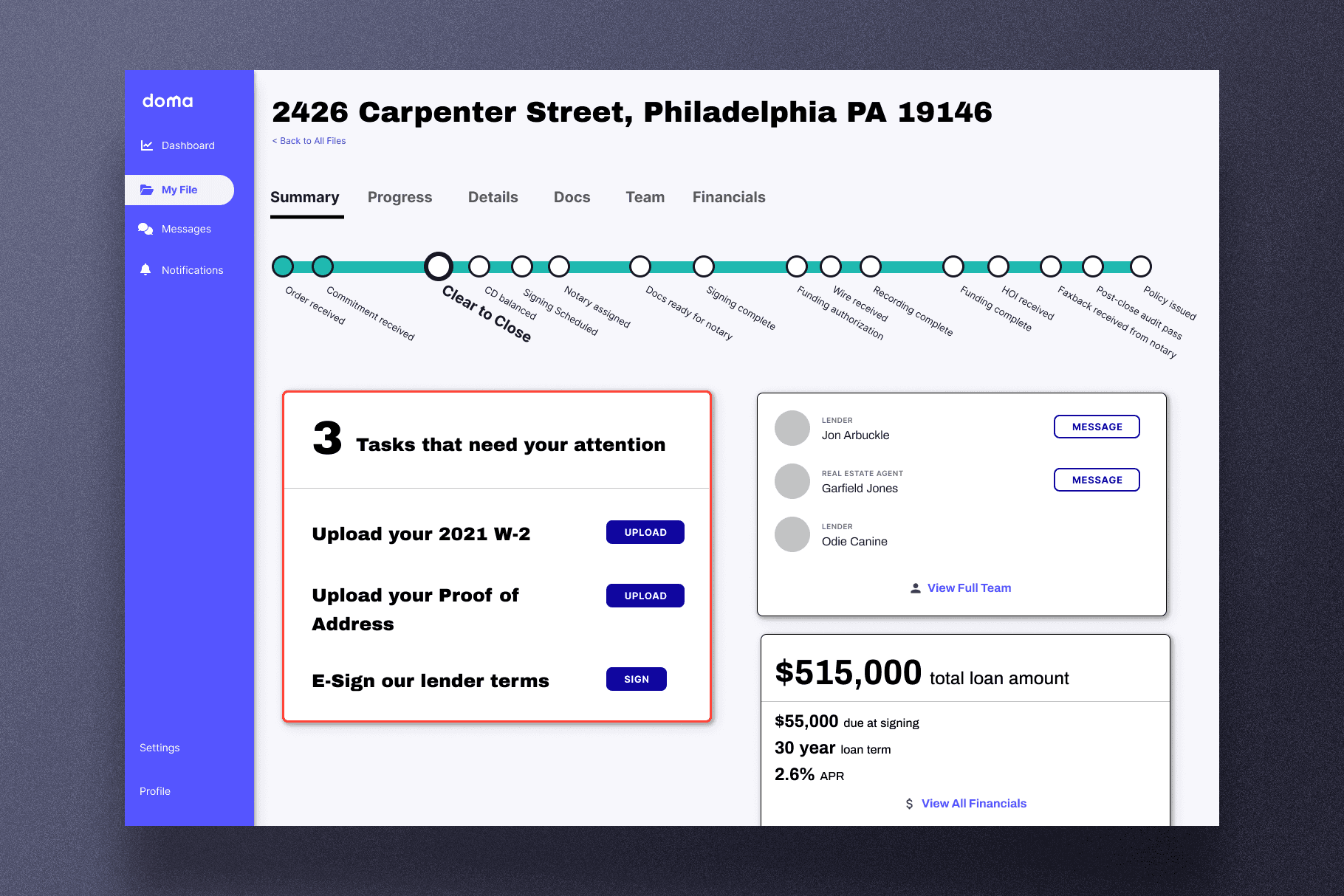
One of our first days of designs, focused on conceptual representations of key elements - timelines, tasks, team & terms.

Early Scheduling workflows, designed to investigate the intensity of the known pain point.
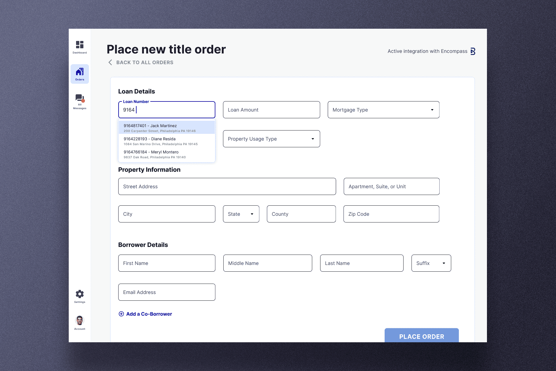
Initial title order flow, designed to replace the known paper-workflow issues - prone to errors and repetitive.

Our first testing artifact, looking at the agent-facing utility of groups of properties based on status, & alerts for each property.
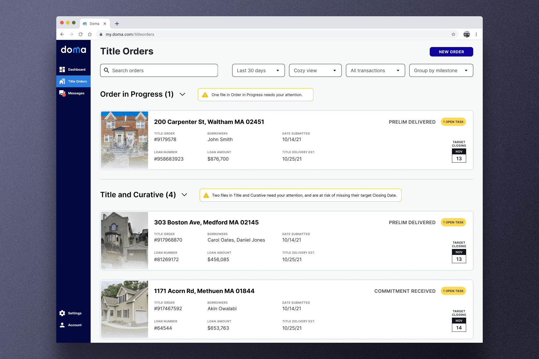
A slightly more stylized version of this page, after testing to confirm utility.
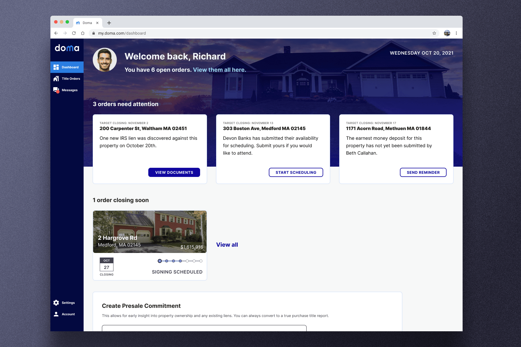
An early screen used to test with our real estate agent audience, focused on task alerts as a key value prop.
year
2023
timeframe
Two Months
tools
Paper | Figma | Dovetail
category
New Product Development
outcome
End to end MVP designs delivered in <4 weeks.
outcome
Opened up two new business lines - REA and Homeowner portals - within 6 months.
outcome
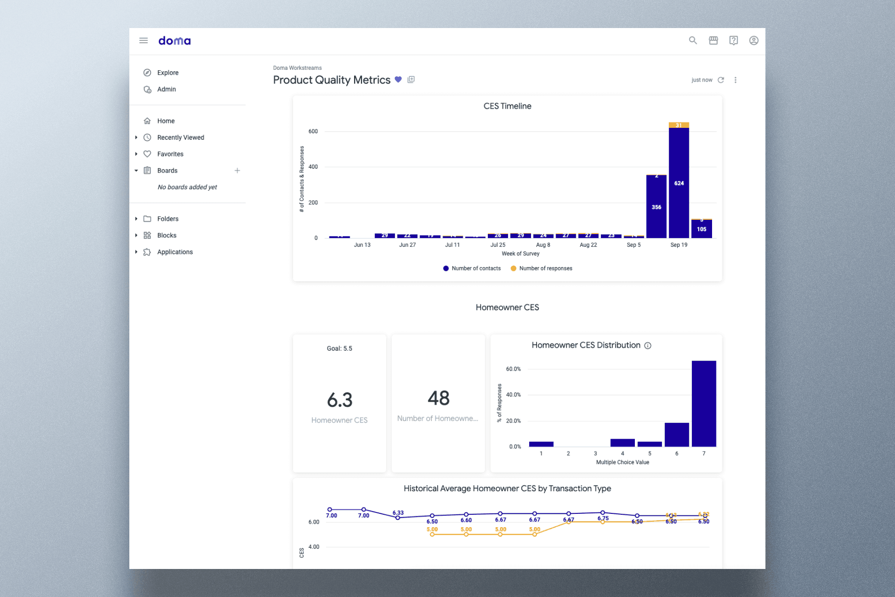
Reduced operations time by ~40% with digital interfaces. Achieved Customer Effort Score of 5.8/7.
Doma software had historically worked behind the scenes - our Escrow Officers worked with agents in person to secure business, which was managed and processed by our internal teams working on Doma's in-house tools. These new products, aimed at homeowners and REAs, helped expose our unique machine intelligence and value to new audiences.

I paired with Kat Cordio - an incredibly talented design manager and peer - on a heads down, four week sprint to kick off this work - we moved from paper prototyping in week one to lo-fi visuals in week two, through to hi-fidelity, interactive designs by week four. At the end of our sprint, we paired with our design systems team to bring our designs into dev-ready screens like the above.
Each week, we spoke with real users, testing and iterating on our designs, and planning prioritized updates for the following week. We divided and conquered our work, trading off page design and testing responsibilities, while juggling stakeholder management and communication.
At the end of this sprint, we were able to get executive buy-in through direct presentations to the C-Suite, including the CEO and CTO, and then worked alongside the rest of the design, product and engineering team to begin implementation and refinement.
Below are samples of our design & our process.

Final iterations of our homeowner facing portal, after working with our design systems team for guidance.

One of our first days of designs, focused on conceptual representations of key elements - timelines, tasks, team & terms.

Early Scheduling workflows, designed to investigate the intensity of the known pain point.

Initial title order flow, designed to replace the known paper-workflow issues - prone to errors and repetitive.

Our first testing artifact, looking at the agent-facing utility of groups of properties based on status, & alerts for each property.

A slightly more stylized version of this page, after testing to confirm utility.

An early screen used to test with our real estate agent audience, focused on task alerts as a key value prop.
year
2023
timeframe
Two Months
tools
Paper | Figma | Dovetail
category
New Product Development
outcome
End to end MVP designs delivered in <4 weeks.
outcome
Opened up two new business lines - REA and Homeowner portals - within 6 months.
outcome
Reduced operations time by ~40% with digital interfaces. Achieved Customer Effort Score of 5.8/7.
Doma software had historically worked behind the scenes - our Escrow Officers worked with agents in person to secure business, which was managed and processed by our internal teams working on Doma's in-house tools. These new products, aimed at homeowners and REAs, helped expose our unique machine intelligence and value to new audiences.

I paired with Kat Cordio - an incredibly talented design manager and peer - on a heads down, four week sprint to kick off this work - we moved from paper prototyping in week one to lo-fi visuals in week two, through to hi-fidelity, interactive designs by week four. At the end of our sprint, we paired with our design systems team to bring our designs into dev-ready screens like the above.
Each week, we spoke with real users, testing and iterating on our designs, and planning prioritized updates for the following week. We divided and conquered our work, trading off page design and testing responsibilities, while juggling stakeholder management and communication.
At the end of this sprint, we were able to get executive buy-in through direct presentations to the C-Suite, including the CEO and CTO, and then worked alongside the rest of the design, product and engineering team to begin implementation and refinement.
Below are samples of our design & our process.

Final iterations of our homeowner facing portal, after working with our design systems team for guidance.

One of our first days of designs, focused on conceptual representations of key elements - timelines, tasks, team & terms.

Early Scheduling workflows, designed to investigate the intensity of the known pain point.

Initial title order flow, designed to replace the known paper-workflow issues - prone to errors and repetitive.

Our first testing artifact, looking at the agent-facing utility of groups of properties based on status, & alerts for each property.

A slightly more stylized version of this page, after testing to confirm utility.

An early screen used to test with our real estate agent audience, focused on task alerts as a key value prop.
year
2023
timeframe
Two Months
tools
Paper | Figma | Dovetail
category
New Product Development
outcome
End to end MVP designs delivered in <4 weeks.
outcome
Opened up two new business lines - REA and Homeowner portals - within 6 months.
outcome
Reduced operations time by ~40% with digital interfaces. Achieved Customer Effort Score of 5.8/7.
Doma software had historically worked behind the scenes - our Escrow Officers worked with agents in person to secure business, which was managed and processed by our internal teams working on Doma's in-house tools. These new products, aimed at homeowners and REAs, helped expose our unique machine intelligence and value to new audiences.

I paired with Kat Cordio - an incredibly talented design manager and peer - on a heads down, four week sprint to kick off this work - we moved from paper prototyping in week one to lo-fi visuals in week two, through to hi-fidelity, interactive designs by week four. At the end of our sprint, we paired with our design systems team to bring our designs into dev-ready screens like the above.
Each week, we spoke with real users, testing and iterating on our designs, and planning prioritized updates for the following week. We divided and conquered our work, trading off page design and testing responsibilities, while juggling stakeholder management and communication.
At the end of this sprint, we were able to get executive buy-in through direct presentations to the C-Suite, including the CEO and CTO, and then worked alongside the rest of the design, product and engineering team to begin implementation and refinement.
Below are samples of our design & our process.

Final iterations of our homeowner facing portal, after working with our design systems team for guidance.

One of our first days of designs, focused on conceptual representations of key elements - timelines, tasks, team & terms.

Early Scheduling workflows, designed to investigate the intensity of the known pain point.

Initial title order flow, designed to replace the known paper-workflow issues - prone to errors and repetitive.

Our first testing artifact, looking at the agent-facing utility of groups of properties based on status, & alerts for each property.

A slightly more stylized version of this page, after testing to confirm utility.

An early screen used to test with our real estate agent audience, focused on task alerts as a key value prop.
year
2023
timeframe
Two Months
tools
Paper | Figma | Dovetail
category
New Product Development
outcome
End to end MVP designs delivered in <4 weeks.
outcome
Opened up two new business lines - REA and Homeowner portals - within 6 months.
outcome
Reduced operations time by ~40% with digital interfaces. Achieved Customer Effort Score of 5.8/7.
01
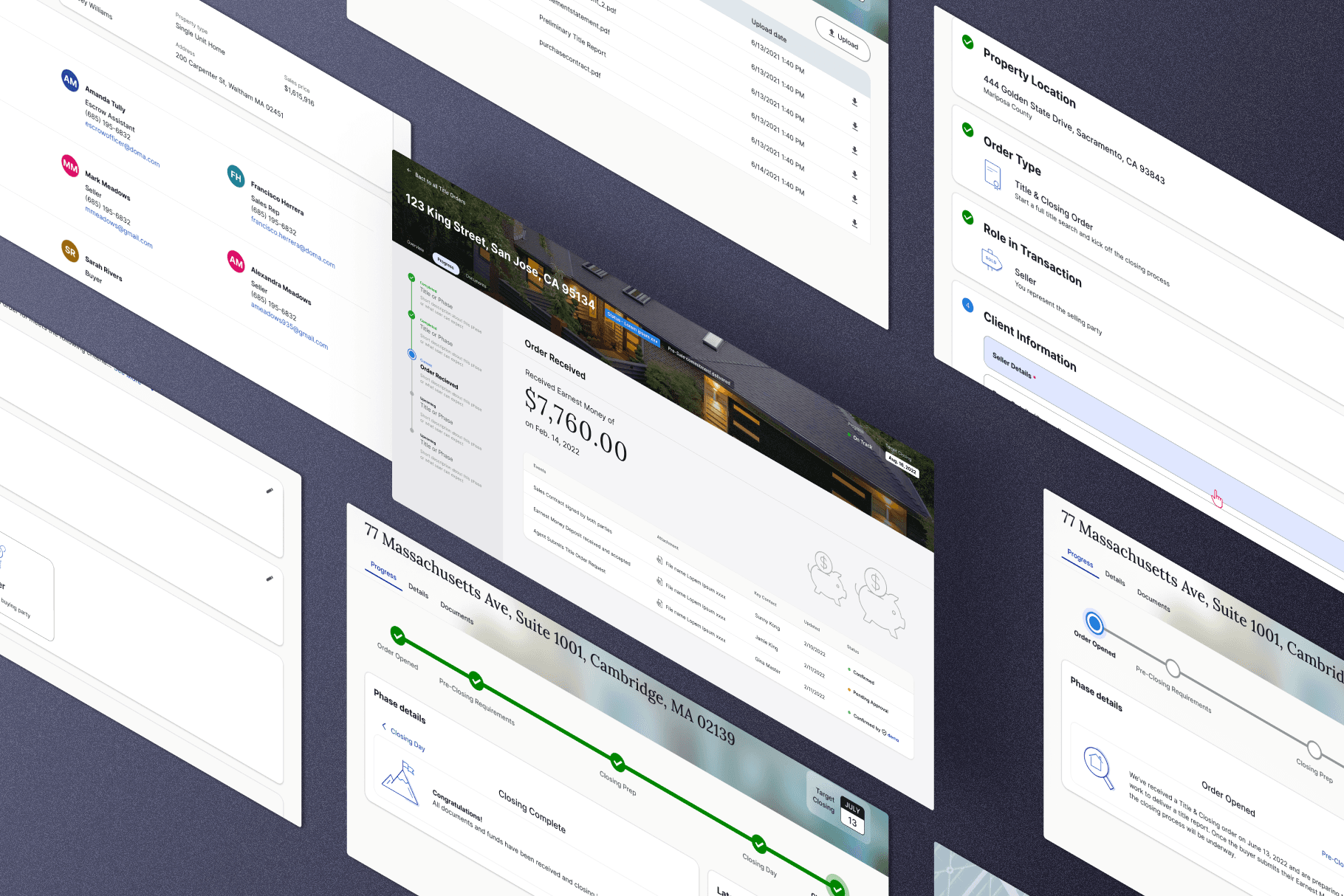
Samples of our screens after additional design refinement.
01

Samples of our screens after additional design refinement.
01

Samples of our screens after additional design refinement.
01

Samples of our screens after additional design refinement.
02

Samples of the mobile versions of these pages.
02

Samples of the mobile versions of these pages.
02

Samples of the mobile versions of these pages.
02

Samples of the mobile versions of these pages.
03
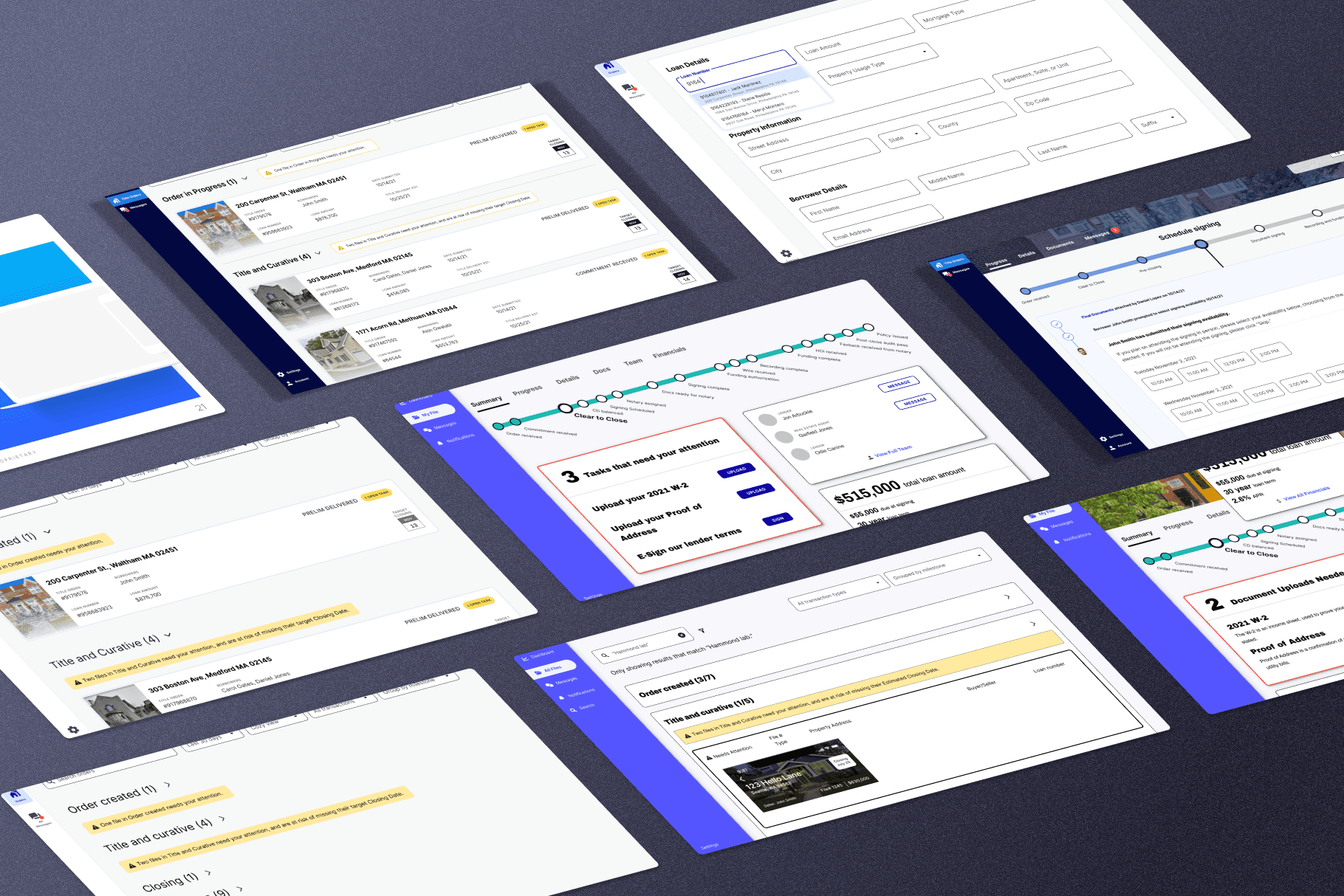
A collection of earlier, lower fidelity versions of these designs to show some of our process & thinking.
03

A collection of earlier, lower fidelity versions of these designs to show some of our process & thinking.
03

A collection of earlier, lower fidelity versions of these designs to show some of our process & thinking.
03

A collection of earlier, lower fidelity versions of these designs to show some of our process & thinking.
