menu
Single Work Page Redesign
Single Work Page Redesign
Single Work Page Redesign
Single Work Page Redesign
Re-imagining the most used page on Academia.edu, with a new emphasis on access and discovery.
Re-imagining the most used page on Academia.edu, with a new emphasis on access and discovery.
Re-imagining the most used page on Academia.edu, with a new emphasis on access and discovery.
Re-imagining the most used page on Academia.edu, with a new emphasis on access and discovery.
00

00

00

00

problem
How do you re-envision the most frequently touched surface on a 100 million user platform?
solution
A brand new reading experience - driven by data, modern aesthetics, and new business opportunities.
problem
How do you re-envision the most frequently touched surface on a 100 million user platform?
solution
A brand new reading experience - driven by data, modern aesthetics, and new business opportunities.
problem
How do you re-envision the most frequently touched surface on a 100 million user platform?
solution
A brand new reading experience - driven by data, modern aesthetics, and new business opportunities.
problem
How do you re-envision the most frequently touched surface on a 100 million user platform?
solution
A brand new reading experience - driven by data, modern aesthetics, and new business opportunities.
Every day, millions of the (at the time) 110 million+ users of Academia.edu would visit the "Single Work Page" - the page where you view, read, download, or save a paper. At the conception of the site, the url would be shared via email or another methods.
However, as our team had developed a proven recommendation algorithm, we wanted to look for opportunities to highlight paper --> paper connections on site. We started with the Single Work Page.
The new designs led to a 141% increase in total on-site engagement, and a 30% lift on downloads. Additionally, the new page framework enabled new reader focused tools, leading to additional millions in revenue.

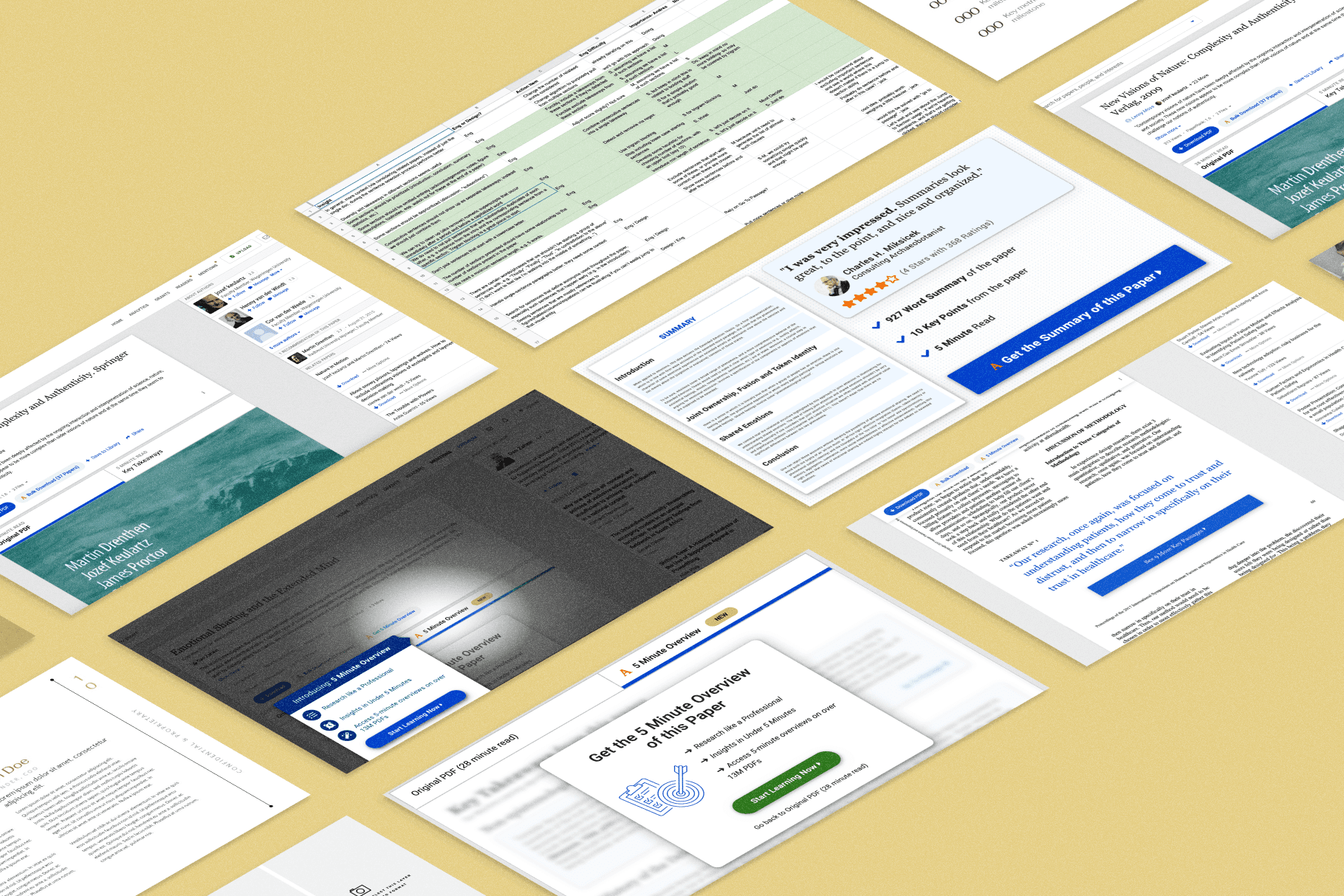
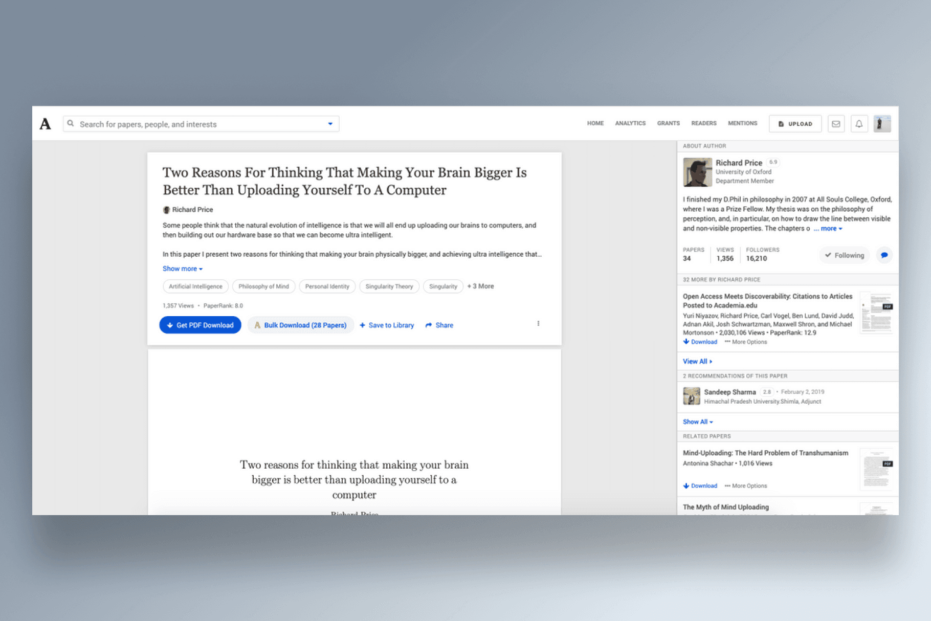
We ran experiments on 5 different versions of the page, testing with interactive webflow prototypes. Each of our prototypes tested a different thesis of what would make this page valuable - e.g. connectedness to other papers, immediacy, topic relationships, etc… - and leaned into it within the design. For example, the design below is our earliest iteration of the paper-relational thesis, which added significant emphasis to the right-hand pane, which held related papers.

The bulk of our directions flopped during resonance testing, but all we needed was one - and we got it with the above design. We doubled down on this paper relationship in future design work as well - see Premium Reader Tools.
year
2020
timeframe
6 Months
tools
Webflow | Pen & Paper
category
Product Design
outcome
141% Increase in on-site engagement
outcome
30% Increase in paper downloads
outcome
Foundation of new reader-focused tools.
Every day, millions of the (at the time) 110 million+ users of Academia.edu would visit the "Single Work Page" - the page where you view, read, download, or save a paper. At the conception of the site, the url would be shared via email or another methods.
However, as our team had developed a proven recommendation algorithm, we wanted to look for opportunities to highlight paper --> paper connections on site. We started with the Single Work Page.

The new designs led to a 141% increase in total on-site engagement, and a 30% lift on downloads. Additionally, the new page framework enabled new reader focused tools, leading to additional millions in revenue.

We ran experiments on 5 different versions of the page, testing with interactive webflow prototypes. Each of our prototypes tested a different thesis of what would make this page valuable - e.g. connectedness to other papers, immediacy, topic relationships, etc… - and leaned into it within the design. For example, the design below is our earliest iteration of the paper-relational thesis, which added significant emphasis to the right-hand pane, which held related papers.

The bulk of our directions flopped during resonance testing, but all we needed was one - and we got it with the above design. We doubled down on this paper relationship in future design work as well - see Premium Reader Tools.
year
2020
timeframe
6 Months
tools
Webflow | Pen & Paper
category
Product Design
outcome
141% Increase in on-site engagement
outcome
30% Increase in paper downloads
outcome
Foundation of new reader-focused tools.
Every day, millions of the (at the time) 110 million+ users of Academia.edu would visit the "Single Work Page" - the page where you view, read, download, or save a paper. At the conception of the site, the url would be shared via email or another methods.
However, as our team had developed a proven recommendation algorithm, we wanted to look for opportunities to highlight paper --> paper connections on site. We started with the Single Work Page.

The new designs led to a 141% increase in total on-site engagement, and a 30% lift on downloads. Additionally, the new page framework enabled new reader focused tools, leading to additional millions in revenue.

We ran experiments on 5 different versions of the page, testing with interactive webflow prototypes. Each of our prototypes tested a different thesis of what would make this page valuable - e.g. connectedness to other papers, immediacy, topic relationships, etc… - and leaned into it within the design. For example, the design below is our earliest iteration of the paper-relational thesis, which added significant emphasis to the right-hand pane, which held related papers.

The bulk of our directions flopped during resonance testing, but all we needed was one - and we got it with the above design. We doubled down on this paper relationship in future design work as well - see Premium Reader Tools.
year
2020
timeframe
6 Months
tools
Webflow | Pen & Paper
category
Product Design
outcome
141% Increase in on-site engagement
outcome
30% Increase in paper downloads
outcome
Foundation of new reader-focused tools.
Every day, millions of the (at the time) 110 million+ users of Academia.edu would visit the "Single Work Page" - the page where you view, read, download, or save a paper. At the conception of the site, the url would be shared via email or another methods.
However, as our team had developed a proven recommendation algorithm, we wanted to look for opportunities to highlight paper --> paper connections on site. We started with the Single Work Page.

The new designs led to a 141% increase in total on-site engagement, and a 30% lift on downloads. Additionally, the new page framework enabled new reader focused tools, leading to additional millions in revenue.

We ran experiments on 5 different versions of the page, testing with interactive webflow prototypes. Each of our prototypes tested a different thesis of what would make this page valuable - e.g. connectedness to other papers, immediacy, topic relationships, etc… - and leaned into it within the design. For example, the design below is our earliest iteration of the paper-relational thesis, which added significant emphasis to the right-hand pane, which held related papers.

The bulk of our directions flopped during resonance testing, but all we needed was one - and we got it with the above design. We doubled down on this paper relationship in future design work as well - see Premium Reader Tools.
year
2020
timeframe
6 Months
tools
Webflow | Pen & Paper
category
Product Design
outcome
141% Increase in on-site engagement
outcome
30% Increase in paper downloads
outcome
Foundation of new reader-focused tools.
01

The direction that our team ended up going with
01

The direction that our team ended up going with
01

The direction that our team ended up going with
01

The direction that our team ended up going with
02

A version that swapped the placement of the supplemental info the left, adding in a few additional fields.
02

A version that swapped the placement of the supplemental info the left, adding in a few additional fields.
02

A version that swapped the placement of the supplemental info the left, adding in a few additional fields.
02

A version that swapped the placement of the supplemental info the left, adding in a few additional fields.
03

An early version that emphasized Research topics related to a paper.
03

An early version that emphasized Research topics related to a paper.
03

An early version that emphasized Research topics related to a paper.
03

An early version that emphasized Research topics related to a paper.
